DESIGN / CREATIVE DIRECTOR
BAVARIA BLUE BOOK
Global Brand identity and Guidelines
IS HAS TO BE BLUE
Concept Development / Design / Illustration
Bavaria is a Dutch beverage group that includes a variety of brandname products that are sold across the globe.
Originally started as a beer brand, the group has grown to cover both alcoholic and non-alcoholic beverages.
The variety in brands within the Bavaria group require a well defined and structured set of guidelines to ensure consistant branding across global markets.
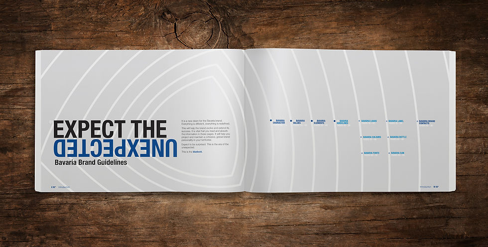
The 'Blue Book' is created to give a clear definition of the overall brand philosophy for use across all global markets. Additionally the book is also the global brand guidelines for all markets.
Key to making the guidelines effective was the need to capture the users attention through dynamic concepts that gave a dynamic brand statement.
The house style of the brand guidelines was used for all other forms of brand communication, both to consumers and internally within the group.
Cover
Contents

Our Team
Cover
-Global Product Guidelines
BAVARIA PRODUCT BOOK
Cover
Introduction
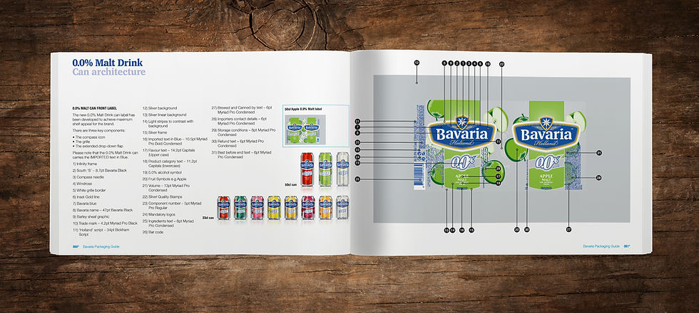
0.0% Alcohol Can Labeling
Cover
TRUE BLUE
Concept Development / Design / Illustration
Bavaria is a group with a wide variety of brands, ranging from premium beers through to non-alcoholic beverages. Combine this with a global market and their product range becomes very diverse.
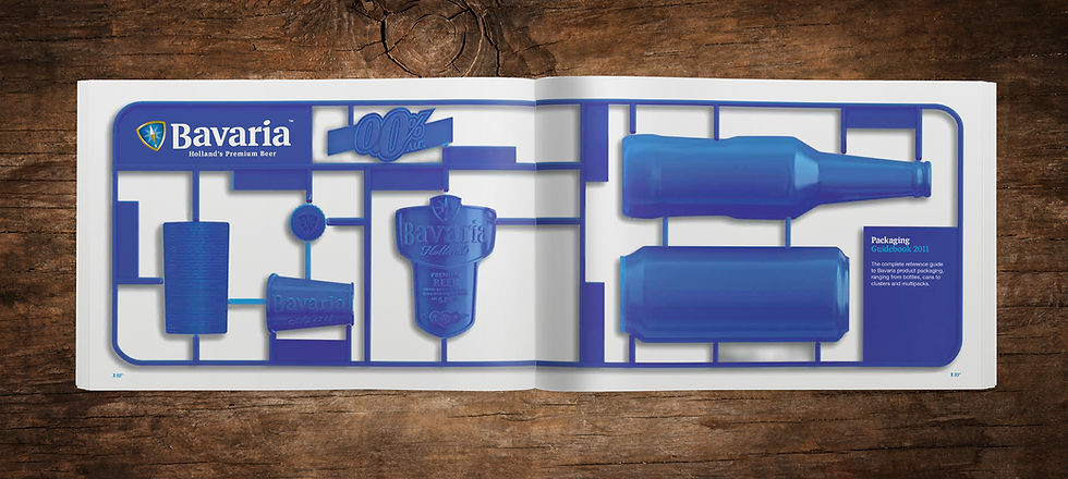
To reduce the confusion and add clarity to their brand communication they required a Packaging Book for use across all of their different markets.
The book design was to compliment their new Brand Book (Blue Book) and therefore used the same house style. New features were added like the Xray illustration style to give mundane technical information a dynamic lift. Section dividers used 3-dimensional break-outs of the packaging to create a distinctive visual.
The book was to become the packaging 'manual' for all Bavaria markets.
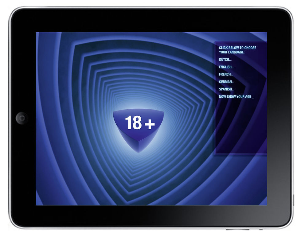
Home screen
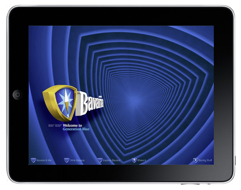
Home screen
DYNAMIC EXPERIENCE
Concept Strategy / Design / Illustration
Bavaria as a brand had a limited digital presence, which was mainly restricted toit's home market in Holland. With the development of their new brand guidelines (Blue Book), they decided to reposition their digital focus to a wider, more global perspective.
To suit this new approach we decided to create a site that was more about experiencing the brand rather than trying to sell more product.
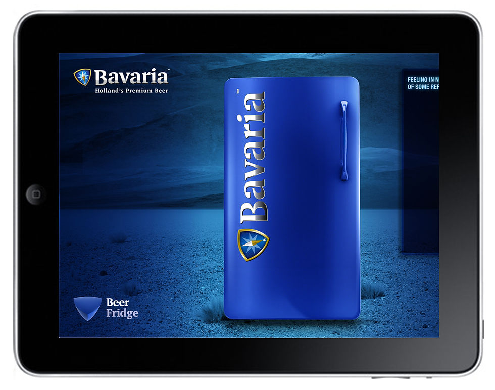
The Blue Tube was created to offer the visual impression of zooming through a blue tricoid world, similar to a tube train. Different stops allowed the user to step off into special zones that defined the core values of the brand.
Every feature was to be different, offering a unique view of the brand, whilst following the new brand design style. To maintain interest the site was created to have a short lifespan before evolving into a second phase of change.
Additional creative support by Remke Cornellis (design) & Neill Bruce (copy).
Rebranded Website Experience